Be it app design or traditional media, a clear visual hierarchy is essential to good layout and effective communication. Having a well-defined visual hierarchy ensures that users see the information that you want them to see and in the way that it is intended to be consumed. With type, the most obvious technique to creating a hierarchy is to create a disparity in font size amongst type elements. And as such, when we think of “big type”, we often think of important type elements such as newspaper headlines and book titles.
Anyone who’s suffered an amateur PowerPoint deck can relate: manipulation of font-size alone can be crude. This is particularly true of mobile web, where font sizes can only be increased or decreased so much before things start becoming illegible or space constrained. As such it’s a valuable design skill to understand how even subtle changes to other properties (besides font size) can deliver a similar effect.
Here are some thoughts on those techniques:
Font Weight
Conventionally, body copy is set in the the chosen font’s “normal” font weight. Frequently, headlines, labels, and other emphasized type is set in a heavier weight. Conversely, less important elements are frequently set in a lighter weight. Here’s an example of these principles put to work.

Flipboard for iOS. The headline is set apart from the body copy by both its large size and bold weight.
Color
Links: don’t let links get lost in the copy. Links should be clearly defined and visible, either as a separate color or perhaps underlined.
White is a color too. It may be a background default or “go-to”, but it’s important to consider the effect your background color (and any textures imposed on it) has in shaping your design. On a white background, with black body copy, important type elements are frequently set in a higher contrast, more luminescent color - perhaps a bold red or blue. Less important elements might be set in a lower contrast, less vibrant color - like a cool gray.
Color should not be used decoratively if it is relied on as a hierarchical attribute. Rather, it’s important to use it consistently throughout a design, as users will establish a relationship between the colors you’ve chosen and the classes of information associated with them. For example, reserving a shade of blue for all “feature tooltips” tells your users that whenever they see that particular blue there’s more information available just a tap (or click) away. This allows users to quickly scan a page while picking up on your informational cues.
Legibility is very important; know when to set personal taste aside. Even if your favorite color is yellow, using it for body copy on a white background would render it almost completely illegible, as there is very little contrast between the two colors.

Twitter for iOS. The type elements are colored clearly and consistently: black for real names, gray for usernames, and blue for links.
Spacing
What’s not there can do more than what is there. Indents, line breaks, and other meaningful intervals between elements help us to optically group anatomical elements together, make type more legible, and assign importance within the hierarchy.
Ordering and Sequence
Rule of thumb: if it’s important it should be placed at the top. If it’s less important it should not occupy such precious real estate as the top of a page or headlining section. Most understand this intuitively. In horizontal or multi-column layouts, more important elements are usually placed on the left as users read from left to right as that is how the eye naturally travels (assuming the content is written in a left-to-right language). We have little control over when a user bounces from our mobile site or closes our app, so be sure the information that you want to get across is positioned appropriately.

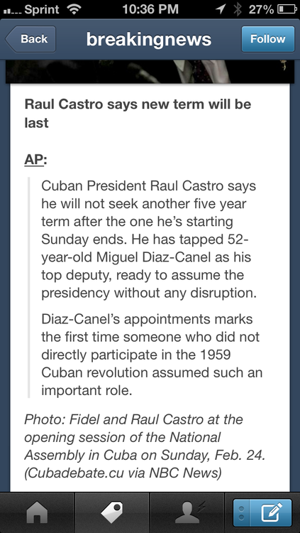
Tumblr for iOS. The headline is placed at the top, with ample space underneath before the content starts. The following two paragraphs are indented to indicate that they are excerpts from another publication.
Typefaces
As a general rule, fewer typefaces is better. This is particularly true on mobile due to space constraints and the likelihood that your mobile content is more informationally streamlined than its desktop counterpart.
Each typeface has its own ancestry, mood, and personality, so it’s important to know a bit about the type you use and what it says aside from the copy it’s dressing. These nuances can make it challenging to use typefaces in combination with each other to achieve the desired look and feel. Using too many typefaces in one setting can also be jarring for readers, so it’s often best to stick to as few as possible. Even if choosing to use just one typeface, though, it’s possible to generate many different levels of hierarchy by adjusting the properties listed above.

foursquare for iOS. Usernames, locations, and body copy all use the same typeface, albeit in different weights. Addresses for locations use a different typeface with a thinner stroke and set in all caps.
Summary
Developing a type hierarchy can be challenging, especially when designing for a small screen, but the basic rules of typography still apply. Keep these ideas in mind and the hierarchy will seem natural and intuitive to users, allowing your content to be the primary focus.
Simply put: layer your techniques subtly and incrementally, be consistent, and always keep legibility in mind.
—Eric Lo (@ericxlo)